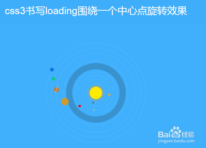
css3书写loading围绕一个中心点旋转效果
1、准备好需要用到的字体图标。

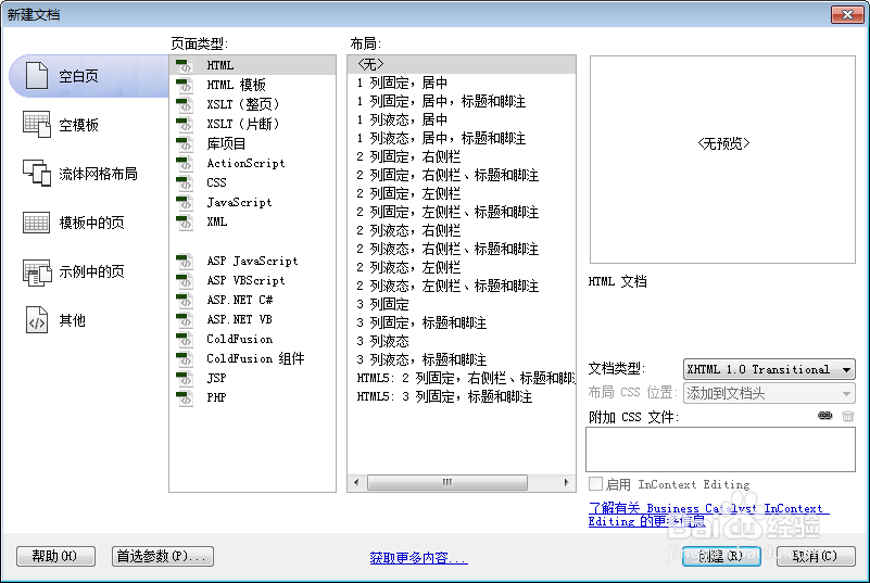
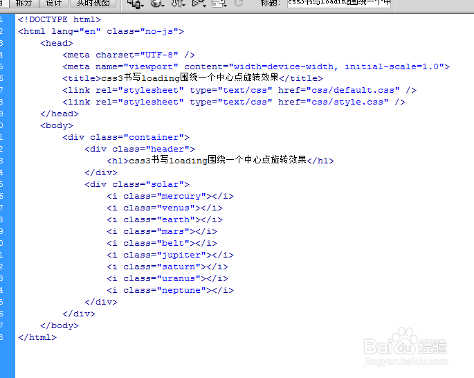
2、新建html文档。
3、书写hmtl代码。
<div class="container">
<div class="header">
<h1>css3书写loading围绕一个中心点旋转效果</h1>
</div>
<div class="solar">
<i class="mercury"></i>
<i class="venus"></i>
<i class="earth"></i>
<i class="mars"></i>
<i class="belt"></i>
<i class="jupiter"></i>
<i class="saturn"></i>
<i class="uranus"></i>
<i class="neptune"></i>
</div>
</div>

4、初始化css代码。
<style>
.clearfix { *zoom: 1;}
.clearfix:before, .clearfix:after { display: table; line-height: 0; content: ""; }
.clearfix:after { clear: both; }
body, html { padding: 0; margin: 0; font-size: 100%; -webkit-text-size-adjust: 100%; -ms-text-size-adjust: 100%; }
@font-face { font-family: 'oxp-demo'; src: url('../fonts/oxp-demo.eot?71650457'); src: url('../fonts/oxp-demo.eot?71650457#iefix') format('embedded-opentype'), url('../fonts/oxp-demo.woff?71650457') format('woff'), url('../fonts/oxp-demo.ttf?71650457') format('truetype'), url('../fonts/oxp-demo.svg?71650457#oxp-demo') format('svg'); font-weight: normal; font-style: normal; }
[class^="icon-"]:before, [class*=" icon-"]:before { font-family: 'oxp-demo'; margin: 0 4px; font-style: normal; font-weight: normal; font-variant: normal; text-transform: none; line-height: 1; speak: none; text-align: center; }
.icon-th:before { content: '\e800'; }
.icon-left:before { content: '\e803'; }
body { font-family: 'Roboto', Arial, sans-serif; color: #fff; background: #40b0fd; }
a, a:visited { color: #888; text-decoration: none; }
a:hover, a:active { color: #333; }
h1, h2, h3 { font-family: 'Roboto', Arial, sans-serif; }
h1 { font-size: 2.5em; font-weight: 300; }
h2 { font-size: 1.5em; font-weight: 300; }
h3 { font-size: 1.2em; font-weight: 400; }
.container .header { margin: 0 auto; padding: 5px; text-align: center; background: rgba(0,0,0,0.01); }
.container .header span { display: block; font-size: 60%; opacity: 0.8; padding-bottom: 0.6em; }
</style>
5、书写css代码。
.solar { margin: 250px auto 350px; height: 50px; width: 50px; background: orange; border-radius: 25px; position: relative; -webkit-animation: glow 1.5s linear infinite; -moz-animation: glow 1.5s linear infinite; }
.solar i { border-radius: 250px; display: block; position: absolute; border: 1px solid rgba(255, 255, 255, 0.15); box-sizing: border-box; -moz-box-sizing: border-box; -webkit-transform-origin: 50% 50%; -moz-transform-origin: 50% 50%; }
.solar i:before { content: ''; border-radius: 25px; background: black; display: block; position: absolute; top: -5px; right: 45%; }
.solar i.mercury { width: 80px; height: 80px; margin-left: -40px; left: 50%; top: 50%; margin-top: -40px; -webkit-animation: orbit .5s linear infinite; -moz-animation: orbit .5s linear infinite; }
.solar i.mercury:before { background: #6F5F5F; height: 7px; width: 7px; }
.solar i.venus { width: 110px; height: 110px; margin-left: -55px; left: 50%; top: 50%; margin-top: -55px; -webkit-animation: orbit 1s linear infinite; -moz-animation: orbit 1s linear infinite; }
.solar i.venus:before { background: #E7A71F; height: 10px; width: 10px; }
.solar i.earth { width: 140px; height: 140px; margin-left: -70px; left: 50%; top: 50%; margin-top: -70px; -webkit-animation: orbit 1.5s linear infinite; -moz-animation: orbit 1.5s linear infinite; }
.solar i.earth:before { background: #63BEE2; height: 10px; width: 10px; }
.solar i.mars { width: 170px; height: 170px; margin-left: -85px; left: 50%; top: 50%; margin-top: -85px; -webkit-animation: orbit 2s linear infinite; -moz-animation: orbit 2s linear infinite; }
.solar i.mars:before { background: red; height: 10px; width: 10px; }
.solar i.belt { box-sizing: border-box; -moz-box-sizing: border-box; border-width: 25px; width: 240px; height: 240px; margin-left: -120px; border-color: rgba(36, 35, 35, 0.21); left: 50%; top: 50%; margin-top: -120px; }
.solar i.jupiter { width: 260px; height: 260px; margin-left: -130px; left: 50%; top: 50%; margin-top: -130px; -webkit-animation: orbit 2.5s linear infinite; -moz-animation: orbit 2.5s linear infinite; }
.solar i.jupiter:before { background: #CF9B2B; top: -15px; height: 30px; width: 30px; }
.solar i.saturn { width: 320px; height: 320px; margin-left: -160px; left: 50%; top: 50%; margin-top: -160px; -webkit-animation: orbit 3s linear infinite; -moz-animation: orbit 3s linear infinite; }
.solar i.saturn:before { background: #CF7A2B; top: -10px; height: 20px; width: 20px; }
.solar i.saturn:after { background: #fff; width: 30px; height: 1px; content: ''; position: absolute; display: block; background: #FFF; width: 30px; height: 1px; content: ''; right: 43.5%; -webkit-transform: rotate(20deg); -moz-transform: rotate(20deg); }
.solar i.uranus { width: 360px; height: 360px; margin-left: -180px; left: 50%; top: 50%; margin-top: -180px; -webkit-animation: orbit 3.5s linear infinite; -moz-animation: orbit 3.5s linear infinite; }
.solar i.uranus:before { background: #10C593; top: -8px; height: 15px; width: 15px; }
.solar i.neptune { width: 400px; height: 400px; margin-left: -200px; left: 50%; top: 50%; margin-top: -200px; -webkit-animation: orbit 4s linear infinite; -moz-animation: orbit 4s linear infinite; }
.solar i.neptune:before { background: #1470E4; top: -8px; height: 15px; width: 15px; }
@-webkit-keyframes orbit { 0% { -webkit-transform:rotate(0deg);} 50% { -webkit-transform:rotate(-180deg);} 100% { -webkit-transform:rotate(-360deg);}}
@-webkit-keyframes glow { 0% { box-shadow: none;} 50% { background: #FFEB00; box-shadow: 0 0 20px orange;} 100% { box-shadow: none;}}
@-moz-keyframes orbit { 0% { -moz-transform:rotate(0deg);} 50% { -moz-transform:rotate(-180deg);} 100% { -moz-transform:rotate(-360deg);}}
@-moz-keyframes glow { 0% { box-shadow: none;} 50% { background: #FFEB00; box-shadow: 0 0 20px orange;} 100% { box-shadow: none;}}
6、代码整体结构。
7、查看效果。