如何创建透明图像 - Hover 效果
1、设置一个图像的初始状态。
img
{
opacity:0.4;
filter:alpha(opacity=40); /* For IE8 and earlier */
}

2、设置一个鼠标的动态效果。
img:hover
{
opacity:1.0;
filter:alpha(opacity=100); /* For IE8 and earlier */
}

3、完整的图像状态流程。
<!DOCTYPE html>
<html>
<head>
<style>
img
{
opacity:0.4;
filter:alpha(opacity=40); /* For IE8 and earlier */
}
img:hover
{
opacity:1.0;
filter:alpha(opacity=100); /* For IE8 and earlier */
}
</style>
</head>
<body>
<h1>图像透明度</h1>
<img src="/i/tulip_peach_blossom_w_s.jpg" alt="Peach Blossom" />
</body>
</html>

4、透明框。使用这个 filter代码就可以实现这样的一个功能。
div.transbox
{
width: 338px;
height: 204px;
margin:30px;
padding:0;
background-color: #ffffff;
border: 1px solid black;
/* for IE */
filter:alpha(opacity=60);
/* CSS3 standard */
opacity:0.6;
}

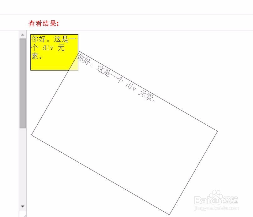
5、做一个旋转的透明元素效果。transform:rotate 这个代码就是可以达到这样的效果。
div#div2
{
transform:rotate(30deg);
-ms-transform:rotate(30deg); /* IE 9 */
-moz-transform:rotate(30deg); /* Firefox */
-webkit-transform:rotate(30deg); /* Safari and Chrome */
-o-transform:rotate(30deg); /* Opera */
}
6、CSS3 边框阴影效果。box-shadow就是一个关键的代码。
<!DOCTYPE html>
<html>
<head>
<style>
div
{
width:300px;
height:100px;
background-color:#ff9900;
-moz-box-shadow: 10px 10px 5px #888888; /* 老的 Firefox */
box-shadow: 10px 10px 5px #888888;
}
</style>
</head>
<body>
<div></div>
</body>
</html>