css3线性渐变linear-gradient角度渐变
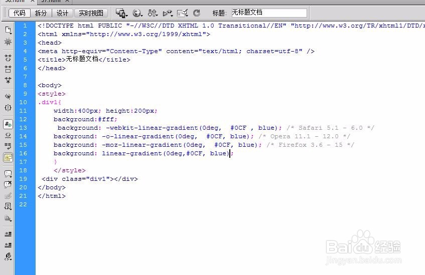
1、新建文件,创建div背景渐变角度是0
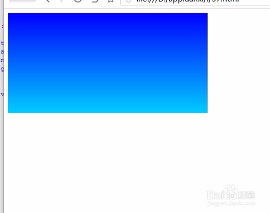
2、效果预览
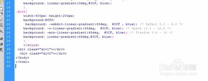
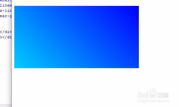
3、div背景渐变角度是45
4、效果预览
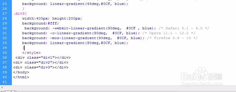
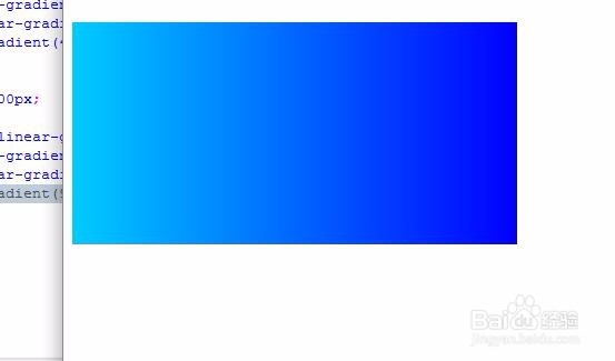
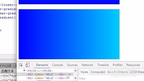
5、div背景渐变角度是90
6、效果预览
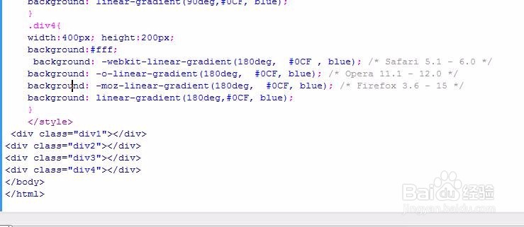
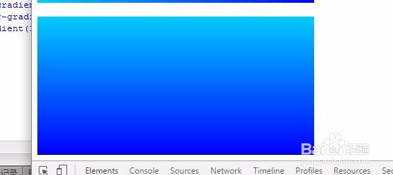
7、div背景渐变角度是180
8、效果预览
9、div背景渐变角度是-90
10、效果预览
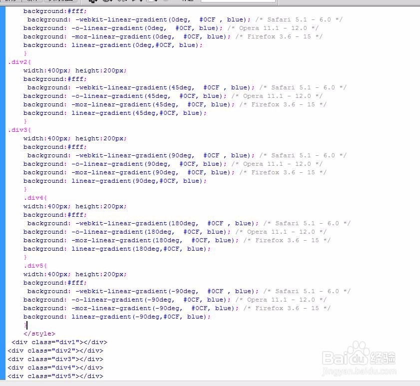
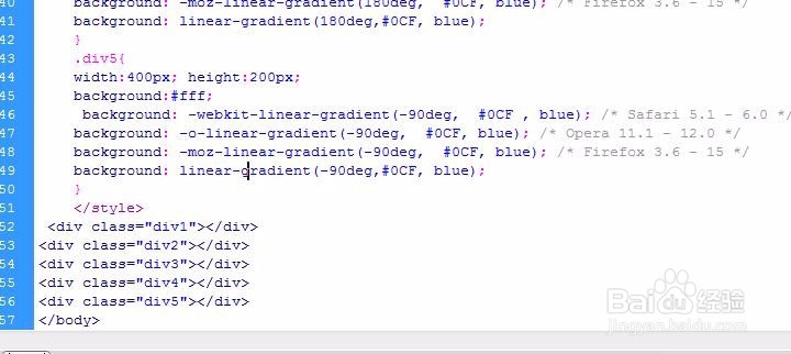
11、附上源码
<body>
<style>
div{ margin-top:20px;}
.div1{
width:400px; height:200px;
background:#fff;
background: -webkit-linear-gradient(0deg, #0CF , blue); /* Safari 5.1 - 6.0 */
background: -o-linear-gradient(0deg, #0CF, blue); /* Opera 11.1 - 12.0 */
background: -moz-linear-gradient(0deg, #0CF, blue); /* Firefox 3.6 - 15 */
background: linear-gradient(0deg,#0CF, blue);
}
.div2{
width:400px; height:200px;
background:#fff;
background: -webkit-linear-gradient(45deg, #0CF , blue); /* Safari 5.1 - 6.0 */
background: -o-linear-gradient(45deg, #0CF, blue); /* Opera 11.1 - 12.0 */
background: -moz-linear-gradient(45deg, #0CF, blue); /* Firefox 3.6 - 15 */
background: linear-gradient(45deg,#0CF, blue);
}
.div3{
width:400px; height:200px;
background:#fff;
background: -webkit-linear-gradient(90deg, #0CF , blue); /* Safari 5.1 - 6.0 */
background: -o-linear-gradient(90deg, #0CF, blue); /* Opera 11.1 - 12.0 */
background: -moz-linear-gradient(90deg, #0CF, blue); /* Firefox 3.6 - 15 */
background: linear-gradient(90deg,#0CF, blue);
}
.div4{
width:400px; height:200px;
background:#fff;
background: -webkit-linear-gradient(180deg, #0CF , blue); /* Safari 5.1 - 6.0 */
background: -o-linear-gradient(180deg, #0CF, blue); /* Opera 11.1 - 12.0 */
background: -moz-linear-gradient(180deg, #0CF, blue); /* Firefox 3.6 - 15 */
background: linear-gradient(180deg,#0CF, blue);
}
.div5{
width:400px; height:200px;
background:#fff;
background: -webkit-linear-gradient(-90deg, #0CF , blue); /* Safari 5.1 - 6.0 */
background: -o-linear-gradient(-90deg, #0CF, blue); /* Opera 11.1 - 12.0 */
background: -moz-linear-gradient(-90deg, #0CF, blue); /* Firefox 3.6 - 15 */
background: linear-gradient(-90deg,#0CF, blue);
}
</style>
<div class="div1"></div>
<div class="div2"></div>
<div class="div3"></div>
<div class="div4"></div>
<div class="div5"></div>
</body>